Seed Street Toys is a small business based in Northern California which prides themselves in creating safety-focused handmade foraging and shredding toys for companion parrots, made to the highest quality possible. After working in an avian hospital and seeing far too many commercial toy-related injuries, the Seed Street founder knew there was a hole in the market for high quality, fun & SAFE toys for our feathered friends.
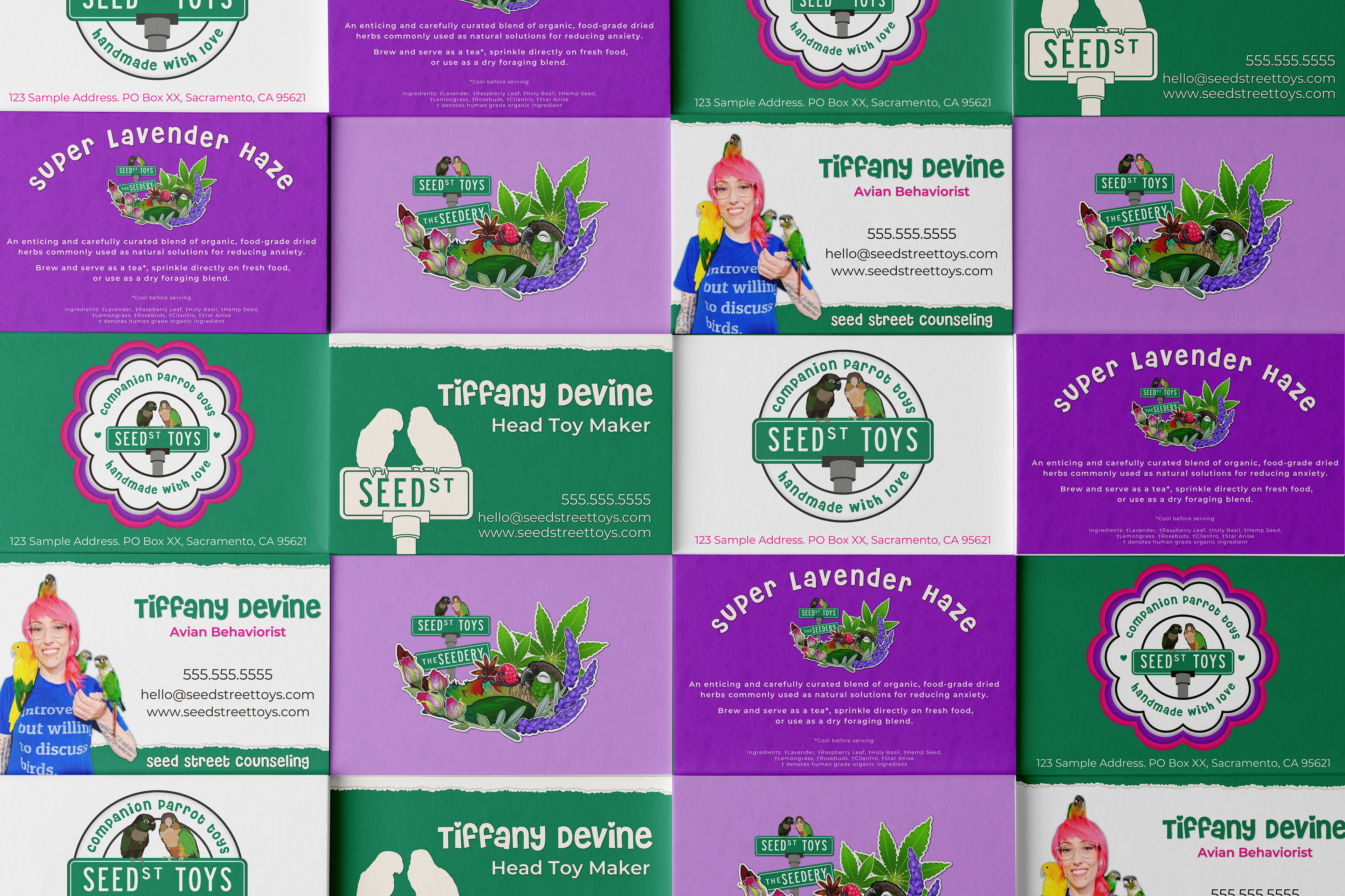
Not only does Seed Street make and sell the most adorable and enriching parrot toys, but the founder has also undergone training from some of the brightest minds in the avian world to become an avian behaviorist. They work diligently to get to the root of behavioral and bonding issues with their clients' companion parrots so that both human and bird may live their best lives.
Not only does Seed Street make and sell the most adorable and enriching parrot toys, but the founder has also undergone training from some of the brightest minds in the avian world to become an avian behaviorist. They work diligently to get to the root of behavioral and bonding issues with their clients' companion parrots so that both human and bird may live their best lives.
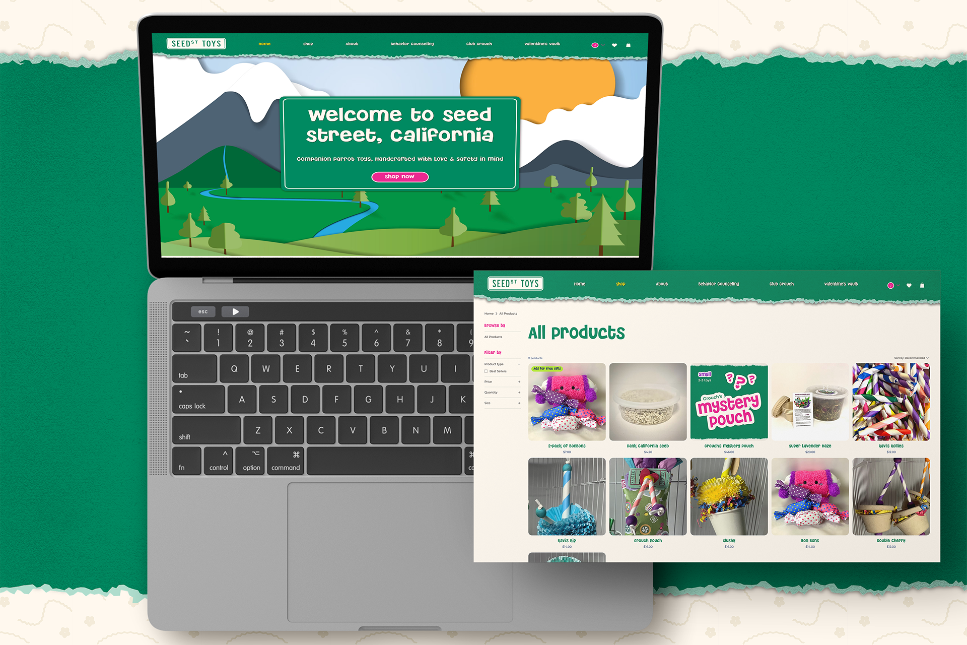
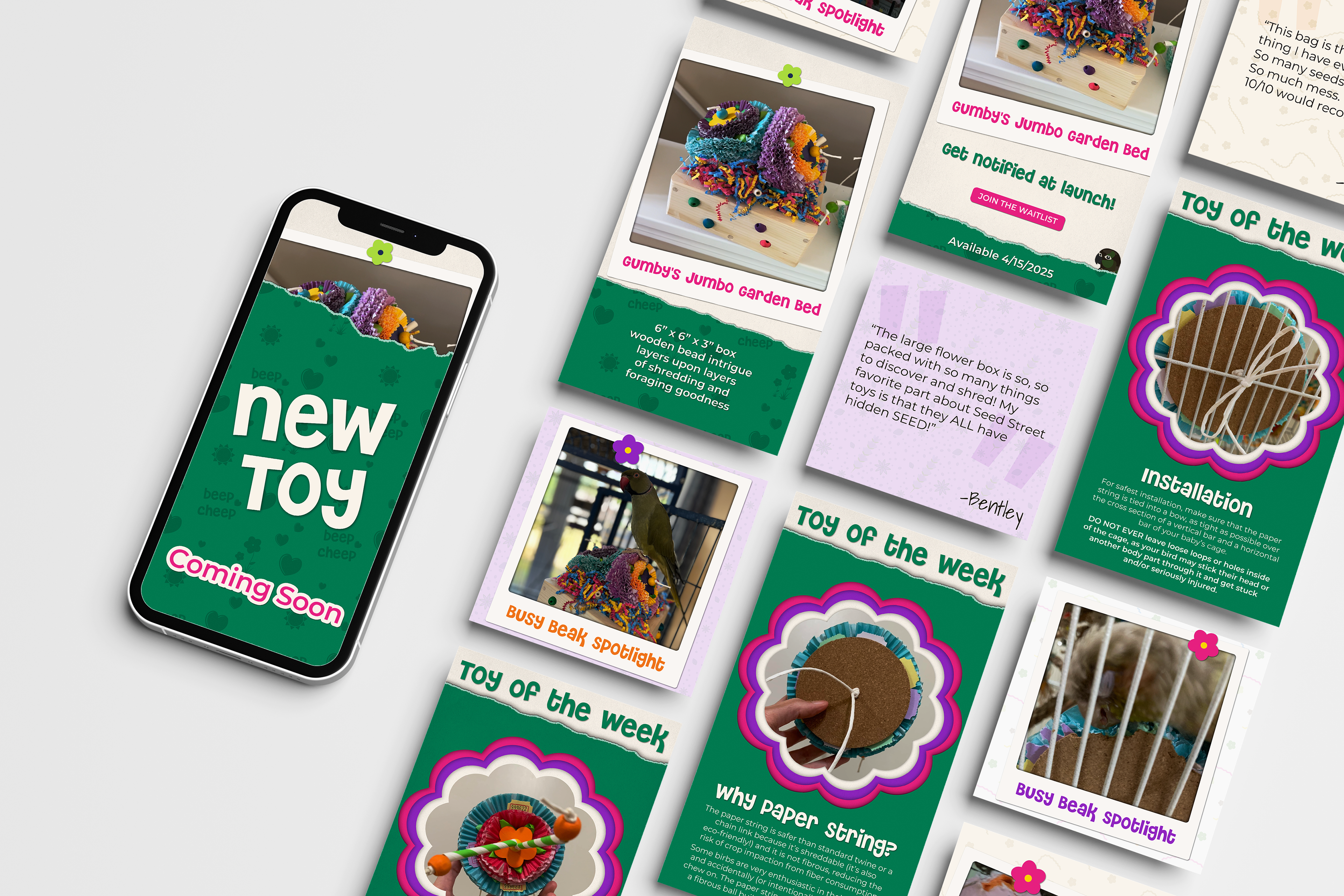
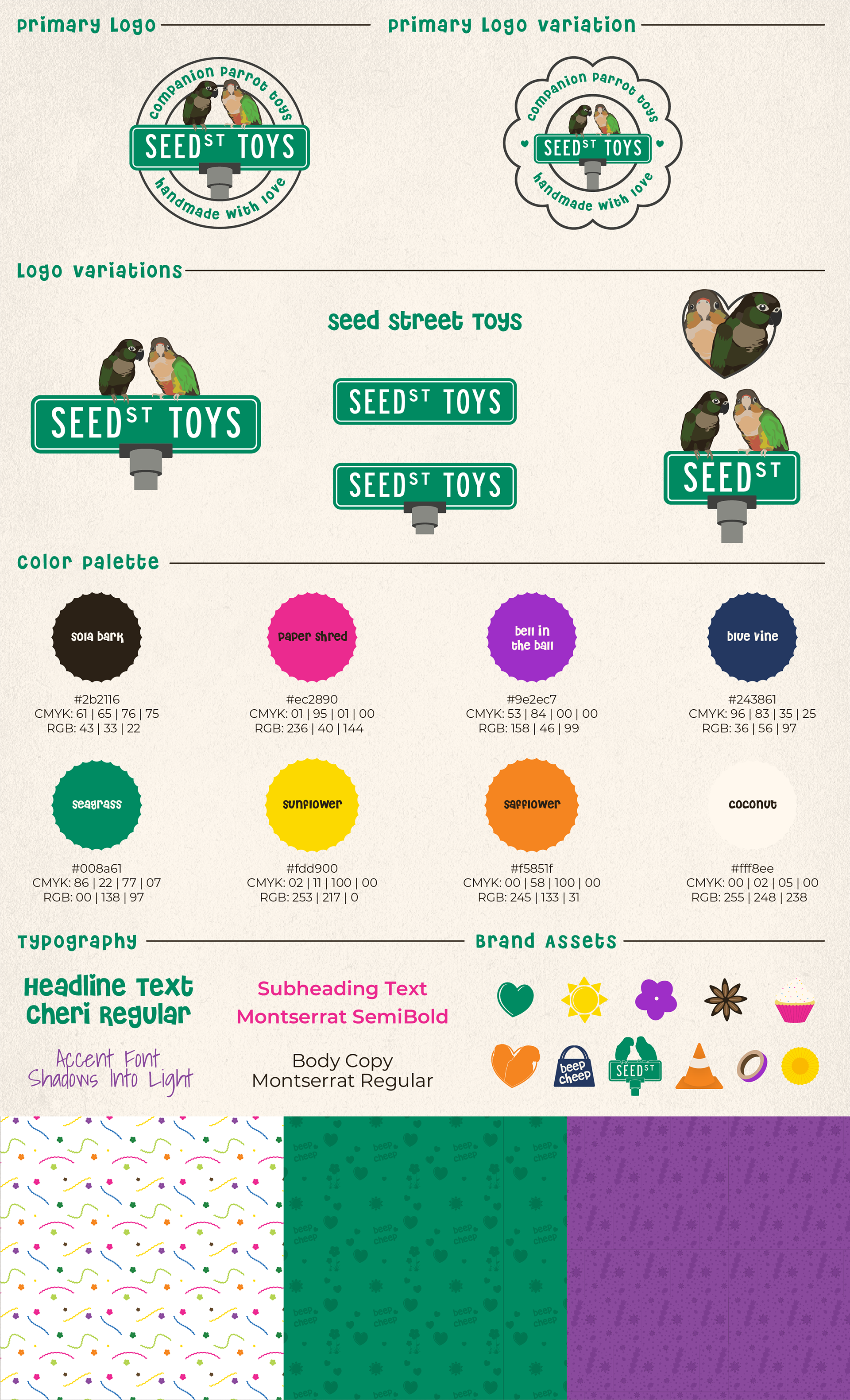
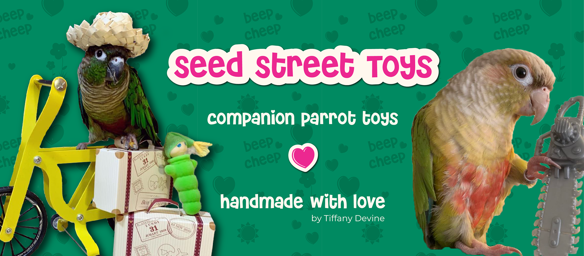
The goal with this brand identity was to create something that captured the heart and feeling of what it is to have companion parrots in your life. They are bold, loud, colorful, playful, adorable, silly, cheeky... the list goes on. I created branding that resonates with what people love the most about their parrots - they're goofy and hilarious.
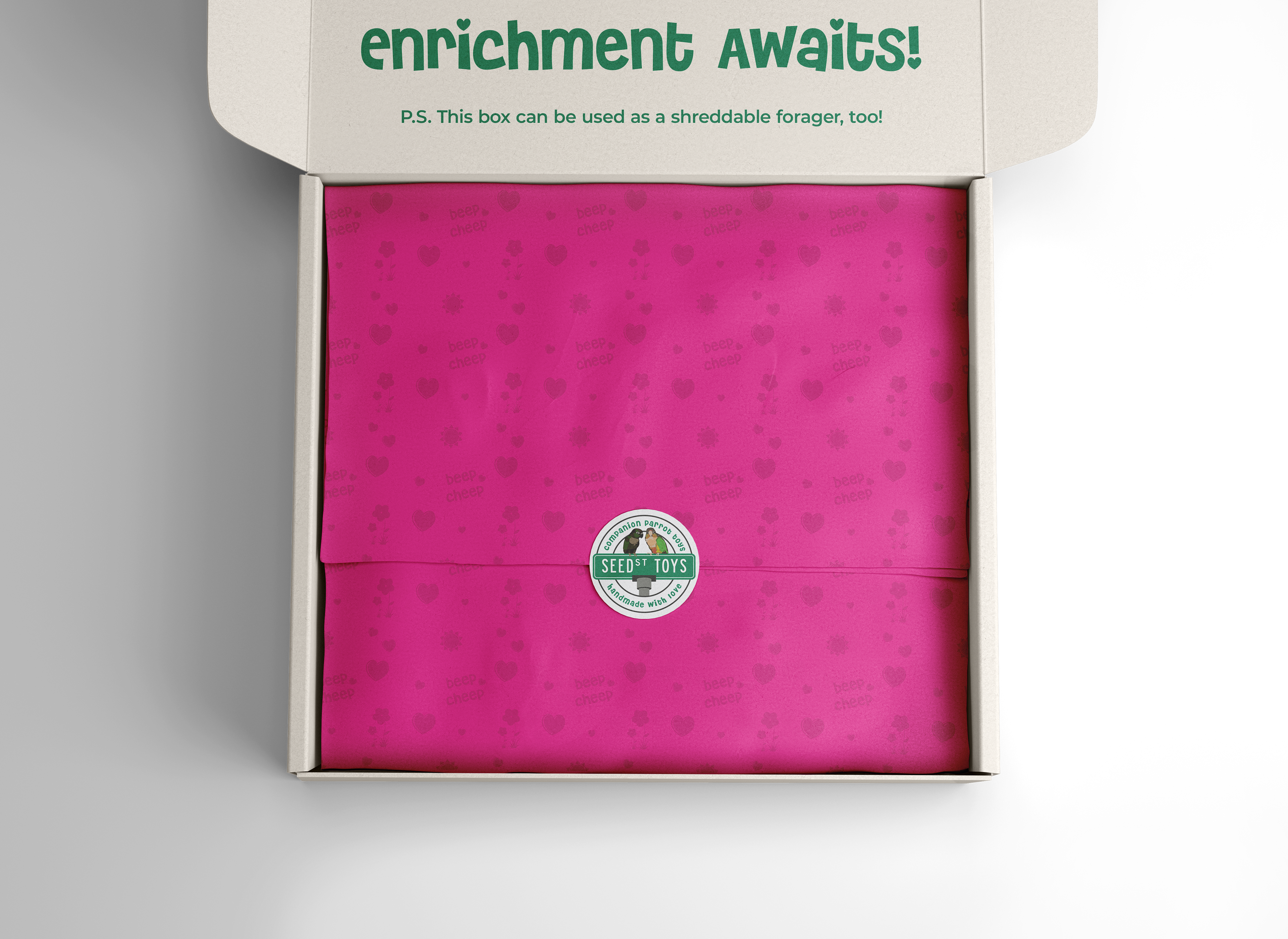
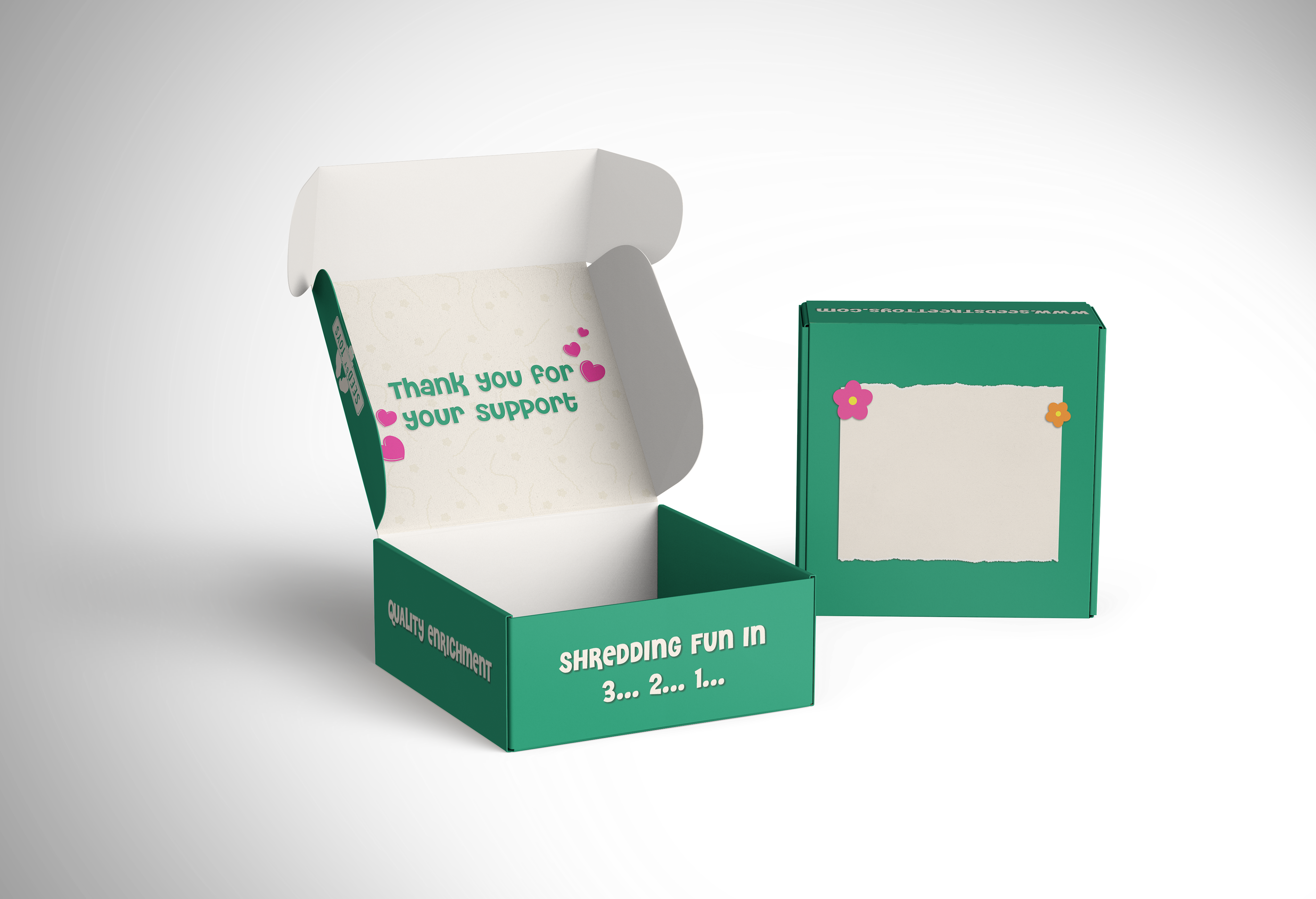
My client and I leaned into the bold & colorful, and included elements of torn or shredded paper in addition to a paper cutout art style to capture not only the toys themselves, but also how birds interact with and destroy them in their joy.
My client and I leaned into the bold & colorful, and included elements of torn or shredded paper in addition to a paper cutout art style to capture not only the toys themselves, but also how birds interact with and destroy them in their joy.
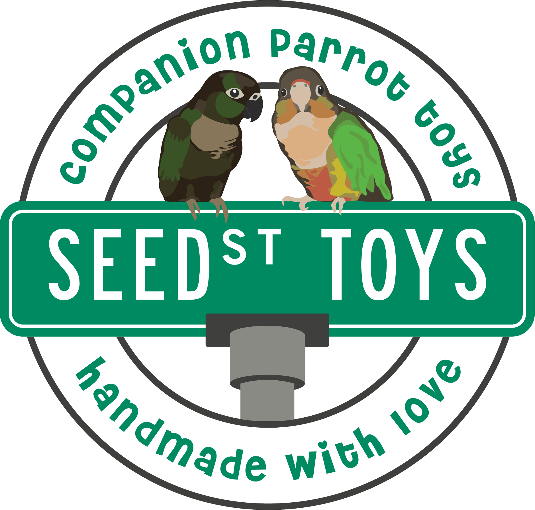
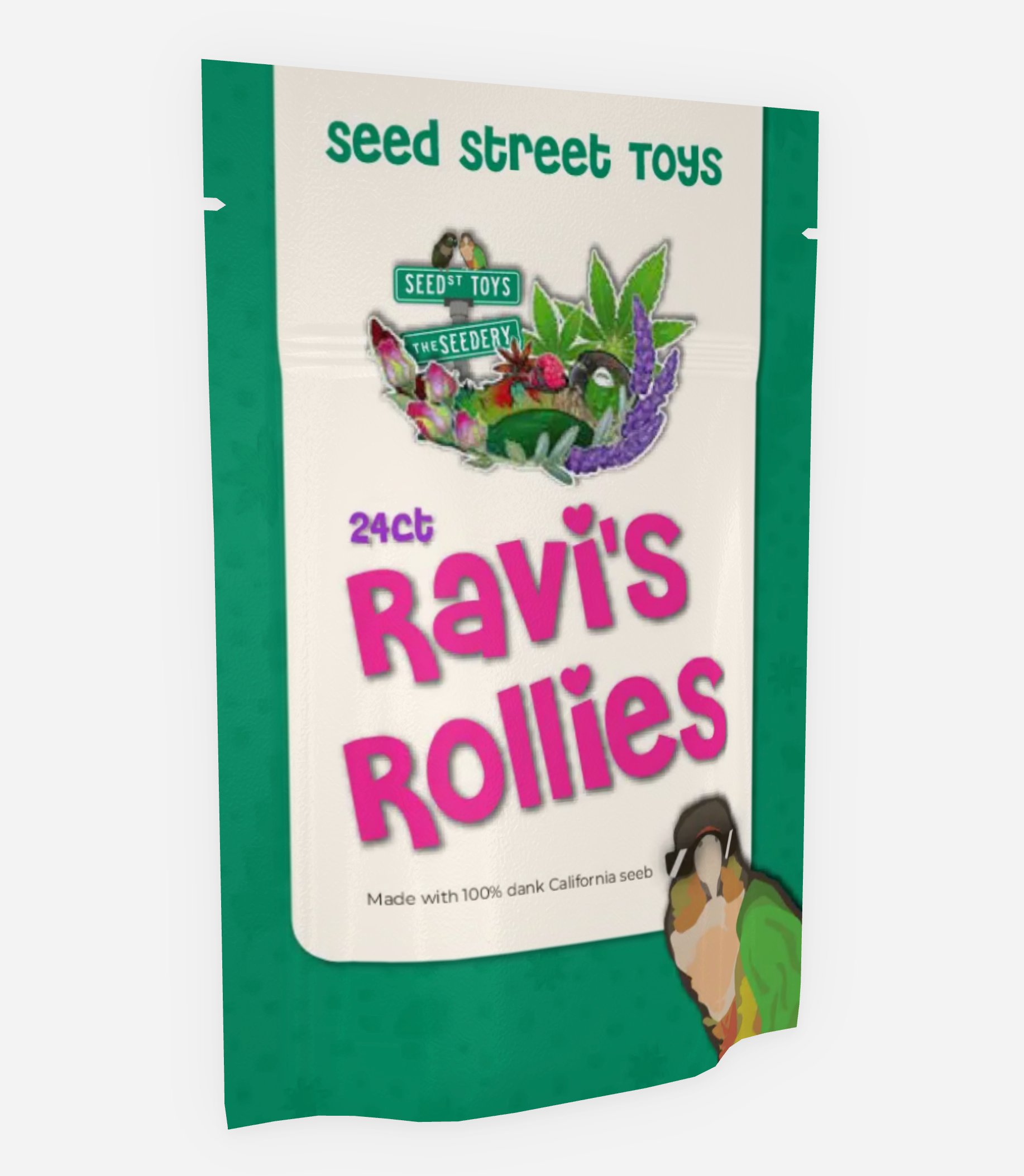
The original logo contained a double-stacked street sign along with two of the owner's own birds and she was very passionate about keeping those elements in her new logo, as they were the most recognizable aspects of her previous branding. In the new logo, I simplified the overall design and carefully selected typography that fit the look and feel of the brand's personality, while still being readable and recognizable.