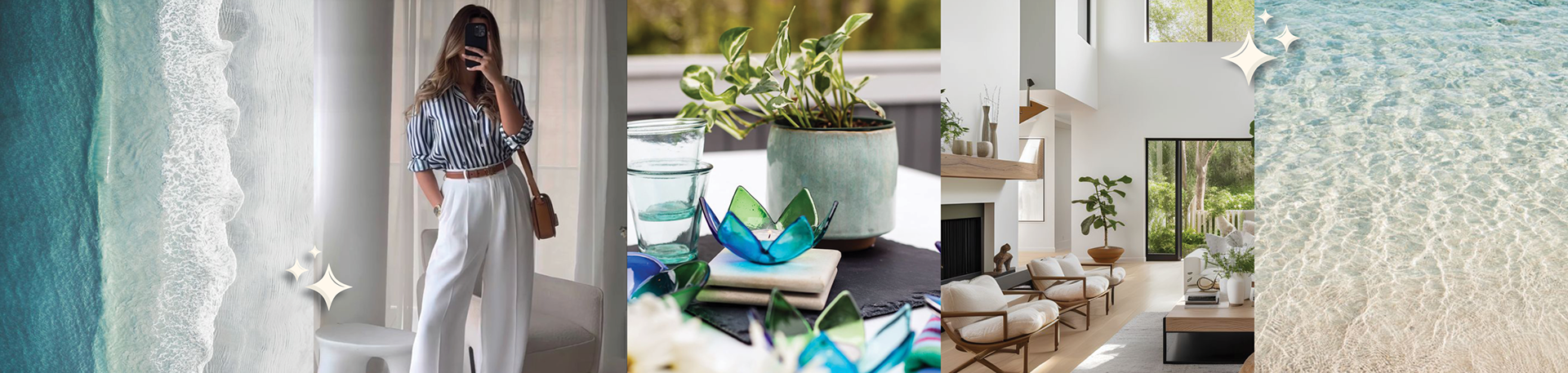
Fused Expressions is owned and operated by a fused glass artist out of their home studio. They find inspiration from nature and Michigan's lakes for their fused creations. They pride themselves on providing affordable and functional luxury decor to their customers, who wish to elevate their space with handmade glass art.
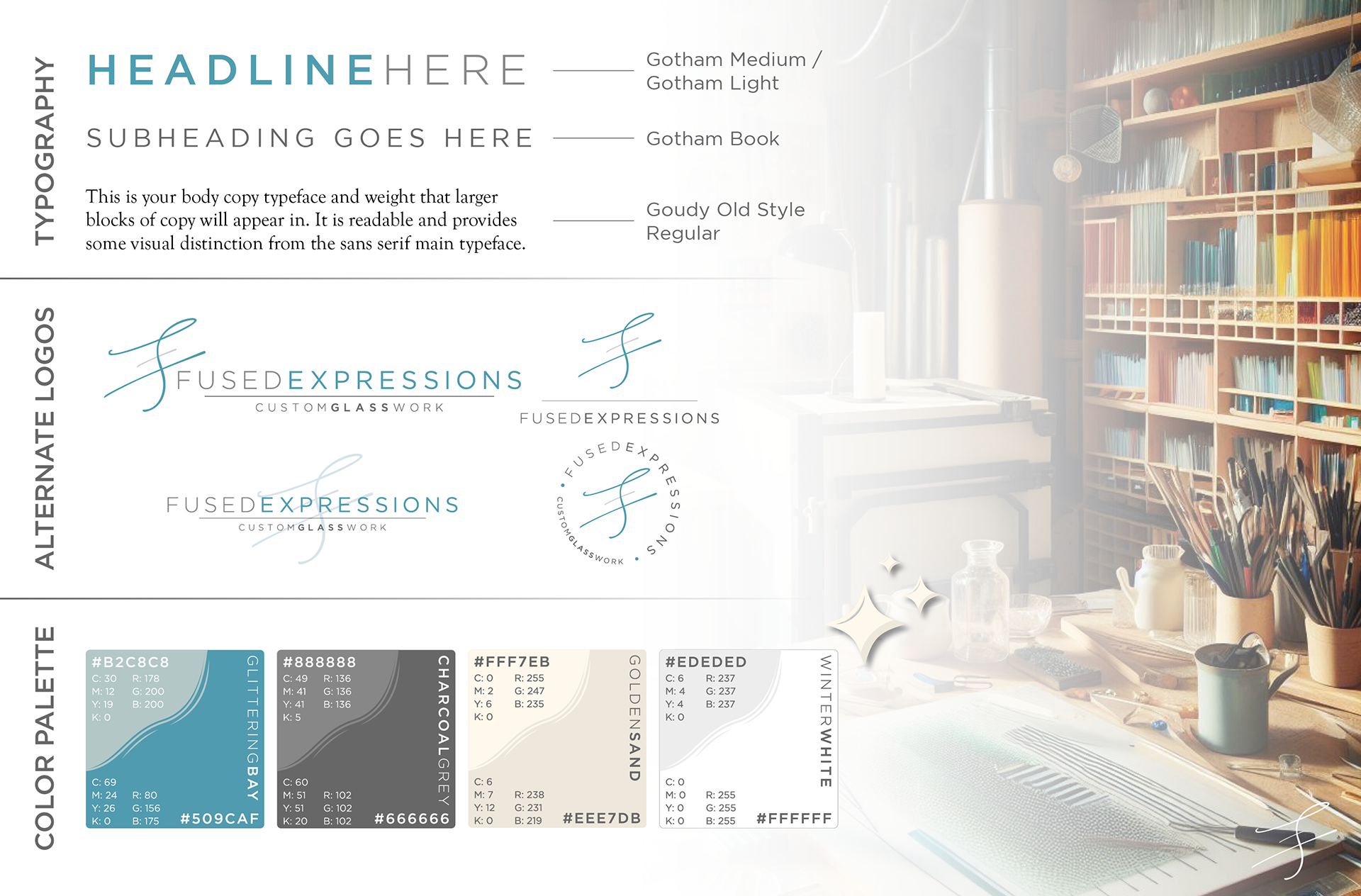
While designing the logo, I knew I wanted to somehow fuse the letters F and E together to symbolize the "fused" part of "fused glass." I ultimately decided to use the thin script typeface for the brand mark to incorporate the fragility and delicate hand needed to create detailed glass masterpieces.
I chose to use the Gotham font family for its readability, clean edges, and minimalistic look, which appeal to the simplicity that their target audience appreciates so much.
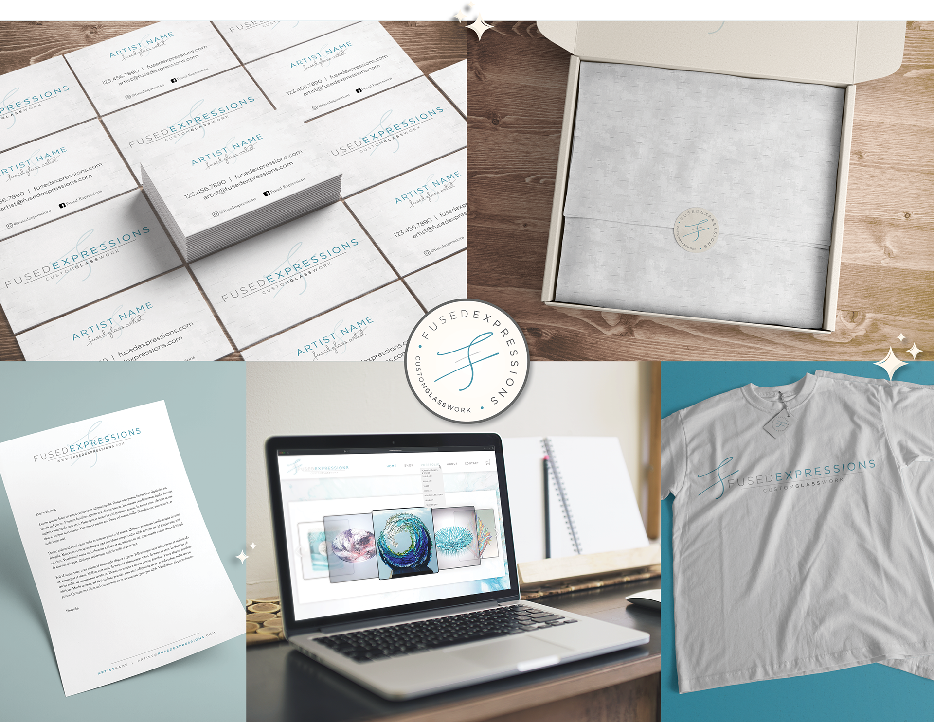
NOTE: The brand identity as shown here was done as a passion project. To see the finalized identity, please visit https://spellboundstudio.com/portfolio